# load
library(faux)
library(lme4)
library(tidyverse)
library(furrr)
library(purrr)
library(ggdist)
library(marginaleffects)
library(glmmTMB)

# adjust the plotting theme
theme_set(
  theme_linedraw() +
    theme(panel.grid = element_blank(),
          strip.background = element_rect(fill = "grey92", color = "grey92"),
strip.text = element_text(color = "black", size = 10)))Intro
This is a response to and extension of the recent blog post by Solomon Kurz (hereafter, SK) which contrasted a set of four modeling options for pre-post RCTs. In short, the four models in R syntax were:
- classic change score model: Y2 - Y1 ~ treatment
- classic ANCOVA model: Y2 ~ Y1 + treatment
- linear mixed model (LMM): Y ~ treatment*time + (1 | ID)
- LMM ANCOVA: Y ~ time + treatment:time + (1 | ID)
The four models were compared in a simulation study for bias and efficiency. Here, I add a minor extension to the simulation study to see how things change when baseline has a truncated distribution, which is often the case in realistic RCT’s due to strict exclusion criteria.
My suspicion is that the classic glm() ANCOVA model will emerge as the best option in this context. The reason being that the LMM’s must include the baseline score as part of the outcome vector, leading it to contain effectively two different distributions. This data generating process is a challenge for LMM’s to represent.
Packages are first loaded and plotting theme set:
Simulate fake BDI-II data
The BDI-II (Beck Depression Inventory) is a widely used tool which is employed to measure the severity of depression symptoms. In depression RCT’s, usually a person has to meet a minimum level of severity to be eligible for inclusion. For instance, a BDI score > 18, indicating moderate-severe depression, is often used as a cut-off. Note that these cut-offs are not limited to psychiatry - for e.g., patients may need to have sufficiently high blood pressure to be eligible for testing an antihypertensive.
We presume that the population expressing interest in the RCT has a mean BDI score of 20 and standard deviation of 6. For this first example, we will apply a threshold of 20 for inclusion. This means that on average half of those individuals in the application pool will be below the threshold for participating.
sim_data <- function(seed = seed, n = n, tau = tau, rho = rho,
                     threshold = threshold) {

  # population values
  m <- 20
  s <- 6

  # simulate and save
  set.seed(seed)

  d <- rnorm_multi(
    n = n,
    mu = c(m, m),
    sd = c(s, s),
    r = rho,
    varnames = list("pre", "post")
  ) %>%
    mutate(tx = rep(0:1, each = n / 2)) %>%
    mutate(post = ifelse(tx == 1, post + tau, post))

  # apply exclusion criteria

  d %>% filter(pre > threshold)

}
An example dataset is created. We set the treatment effect to a reduction of BDI score of 6 points.
# generate data
dw <- sim_data(seed = 1, n = 300, tau = -6, rho = .5,
               threshold = 20)


# long format
dl <- dw %>%
  mutate(id = 1:n()) %>%
  pivot_longer(pre:post,
               names_to = "wave",
               values_to = "y") %>%
  mutate(time = ifelse(wave == "pre", 0, 1))
Plot of histogram displaying baseline truncation
# histograms

dl$wave <- factor(dl$wave, c("pre", "post"))

dl %>%
  ggplot(aes(y = y)) +
  geom_histogram(color = "#000000", fill = "#0099F8") +
  facet_wrap(~ wave) +
  coord_flip()
`stat_bin()` using `bins = 30`. Pick better value with `binwidth`.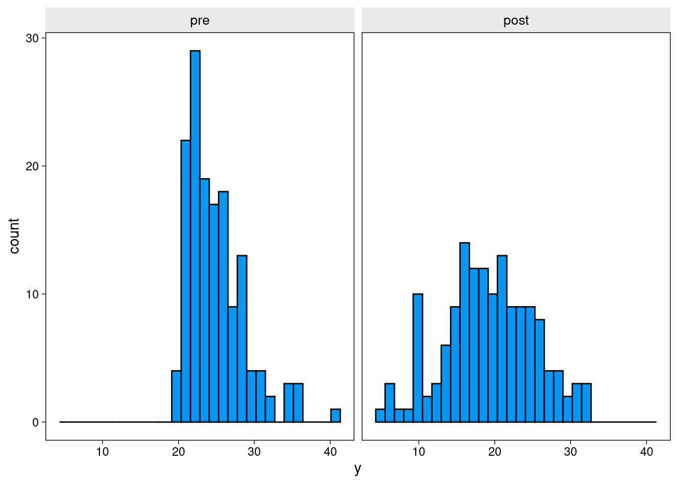
The next plot shows change in symptoms over time. Participants in the control group tend (slightly) toward symptom improvement - despite receiving no treatment. This is typical of depression RCTs. Only individuals who were quite unwell at the time of recruitment could paricipate, after which they may tend to drop down toward normal levels (i.e., regression to the mean). Of course, other factors, such as placebo effects, cause control participants to improve across the trial, but regression to the mean is the only factor at play in this simulation.
# example trends

dl %>%
  ggplot(aes(x = time, y = y)) +
  geom_line(aes(group = id),
            size = 1/4, alpha = 3/4) +
  stat_smooth(method = "lm", se = F, size = 3, formula = y ~ x) +
  scale_x_continuous(breaks = 0:1, labels = c("0 (pre)", "1 (post)"), expand = c(0.1, 0.1)) +
  scale_y_continuous(sec.axis = dup_axis(name = NULL)) +
  ggtitle(expression("100 draws from the population for which "*tau==-6)) +
  facet_wrap(~ tx, labeller = label_both)
Warning: Using `size` aesthetic for lines was deprecated in ggplot2 3.4.0.
ℹ Please use `linewidth` instead.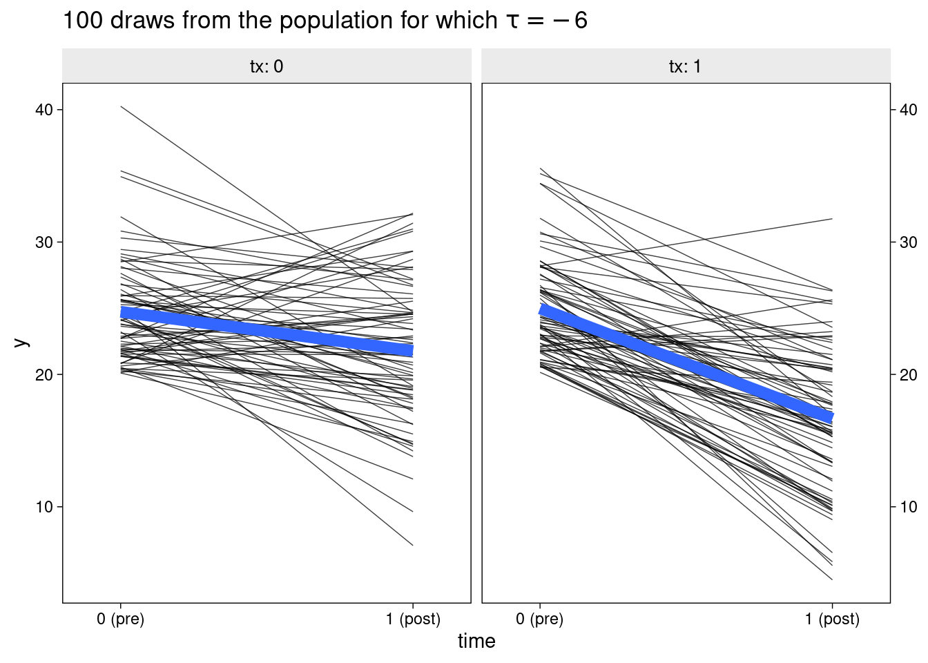
Simulation study
We now replicate SK’s simulation study. As in the original, we use two values for the pre-post correlation, though we use 0.7 in place of 0.8. Secondly, we apply two minimum severity thresholds, designed to cover a range of realistic scenarios. In the first, interested prospective participants must have a BDI score > 16. This excludes about 1/4 of the applicants from being randomised. In the second, a BDI score > 20 is required, excluding half of the pool of potential participants.
The sample sizes of study applicants is inflated to keep the final, randomised sample to approximately 100 participants.
sim_fit <- function(seed = seed, n = n, tau = -6, rho = rho,
                    threshold = threshold) {

  # population values
  m <- 20
  s <- 6

  # simulate wide
  set.seed(seed)

  dw <-
    rnorm_multi(
      n = n,
      mu = c(m, m),
      sd = c(s, s),
      r = rho,
      varnames = list("pre", "post")
    ) %>%
    mutate(tx = rep(0:1, each = n / 2)) %>%
    mutate(post = ifelse(tx == 1, post + tau, post))

  # apply exclusion criteria

  dw <-
    dw %>% filter(pre > threshold)

  # make long
  dl <- dw %>%
    mutate(id = 1:n()) %>%
    pivot_longer(pre:post,
                 names_to = "wave",
                 values_to = "y") %>%
    mutate(time = ifelse(wave == "pre", 0, 1))

  # fit the models
  w1 <- glm(
    data = dw,
    family = gaussian,
    (post - pre) ~ 1 + tx)

  w2 <- glm(
    data = dw,
    family = gaussian,
    post ~ 1 + pre + tx)

  l1 <- lmer(
    data = dl,
    y ~ 1 + tx + time + tx:time + (1 | id))

  l2 <- lmer(
    data = dl,
    y ~ 1 + time + tx:time + (1 | id))

  # summarize
  bind_rows(
    broom::tidy(w1,conf.int=T)[2, c(2:4,6:7)],
    broom::tidy(w2,conf.int=T)[3, c(2:4,6:7)],
    broom.mixed::tidy(l1, conf.int=T)[4, c(4:6,7:8)],
    broom.mixed::tidy(l2, conf.int=T)[3, c(4:6,7:8)]) %>%
    mutate(method = rep(c("glm()", "lmer()"), each = 2),
           model = rep(c("change", "ANCOVA"), times = 2))

}
Now, 1000 unique datasets are simulated for each combination of correlation (rho) and threshold. The treatment effect parameter is extracted from each. The simulations are run in parallel over 4 threads using the furrr package.
plan(multisession, workers = 4)

# rho = 0.4
sim.4.16 <- tibble(seed = 1:1000) %>%
  mutate(tidy = future_map(seed, sim_fit, rho = .4,
                    threshold = 16, n = 160)) %>%
  unnest(tidy)

plan(multisession, workers = 4)

sim.4.20 <- tibble(seed = 1:1000) %>%
  mutate(tidy = future_map(seed, sim_fit, rho = .4,
                    threshold = 20, n = 300)) %>%
  unnest(tidy)

# rho = .7

plan(multisession, workers = 4)

sim.7.16 <- tibble(seed = 1:1000) %>%
  mutate(tidy = future_map(seed, sim_fit, rho = .7,
                    threshold = 16, n = 160)) %>%
  unnest(tidy)

plan(multisession, workers = 4)

sim.7.20 <- tibble(seed = 1:1000) %>%
  mutate(tidy = future_map(seed, sim_fit, rho = .7,
                    threshold = 20, n = 300)) %>%
  unnest(tidy)
Results
The bias in the estimation of the treatment effect is displayed for each of the combinations of method, correlation, and inclusion threshold.
bind_rows(
  sim.4.16 %>% mutate(rho = .4, threshold = 16),
  sim.4.20 %>% mutate(rho = .4, threshold = 20),
  sim.7.16 %>% mutate(rho = .7, threshold = 16),
  sim.7.20 %>% mutate(rho = .7, threshold = 20)) %>%
  mutate(type = str_c(model, ", ", method),
         rho = str_c("rho==", rho),
         threshold = str_c("threshold ==", threshold)) %>%

  ggplot(aes(x = estimate, y = type, slab_color = stat(x), slab_fill = stat(x))) +
  geom_vline(xintercept = -6, color = "grey67") +
  stat_dotsinterval(.width = .5, slab_shape = 22) +
  labs(title = "Parameter bias by model, pre/post correlation, and threshold",
       x = expression(hat(tau)*" (causal effect point estimate)"),
       y = NULL) +
  scale_slab_fill_continuous(limits = c(0, NA)) +
  scale_slab_color_continuous(limits = c(0, NA)) +
  coord_cartesian(ylim = c(1.4, NA)) +
  theme(axis.text.y = element_text(hjust = 0),
        legend.position = "none") +
  facet_wrap(vars(rho, threshold), labeller = label_parsed)
Warning: `stat(x)` was deprecated in ggplot2 3.4.0.
ℹ Please use `after_stat(x)` instead.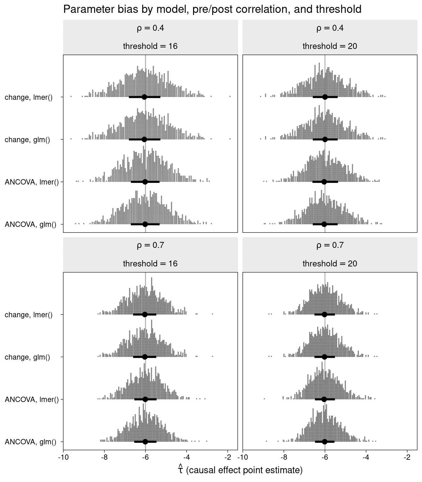
All of the methods are unbiased.
The efficiency (standard error of the treatment effect) is displayed for each of the combinations of method, correlation, and inclusion threshold.
### Efficiency

bind_rows(
  sim.4.16 %>% mutate(rho = .4, threshold = 16),
  sim.4.20 %>% mutate(rho = .4, threshold = 20),
  sim.7.16 %>% mutate(rho = .7, threshold = 16),
  sim.7.20 %>% mutate(rho = .7, threshold = 20)) %>%
  mutate(type = str_c(model, ", ", method),
         rho = str_c("rho==", rho),
         threshold = str_c("threshold ==", threshold)) %>%

  ggplot(aes(x = std.error, y = type, slab_color = stat(x), slab_fill = stat(x))) +
  stat_dotsinterval(.width = .5, slab_shape = 22) +
  labs(title = "Parameter efficiency by model, pre/post correlation, and threshold",
       x = expression(tau[s.e.]*" (causal effect standard error)"),
       y = NULL) +
  scale_slab_fill_continuous(limits = c(0, NA)) +
  scale_slab_color_continuous(limits = c(0, NA)) +
  coord_cartesian(ylim = c(1.4, NA)) +
  theme(axis.text.y = element_text(hjust = 0),
        legend.position = "none") +
  facet_wrap(vars(rho, threshold), labeller = label_parsed)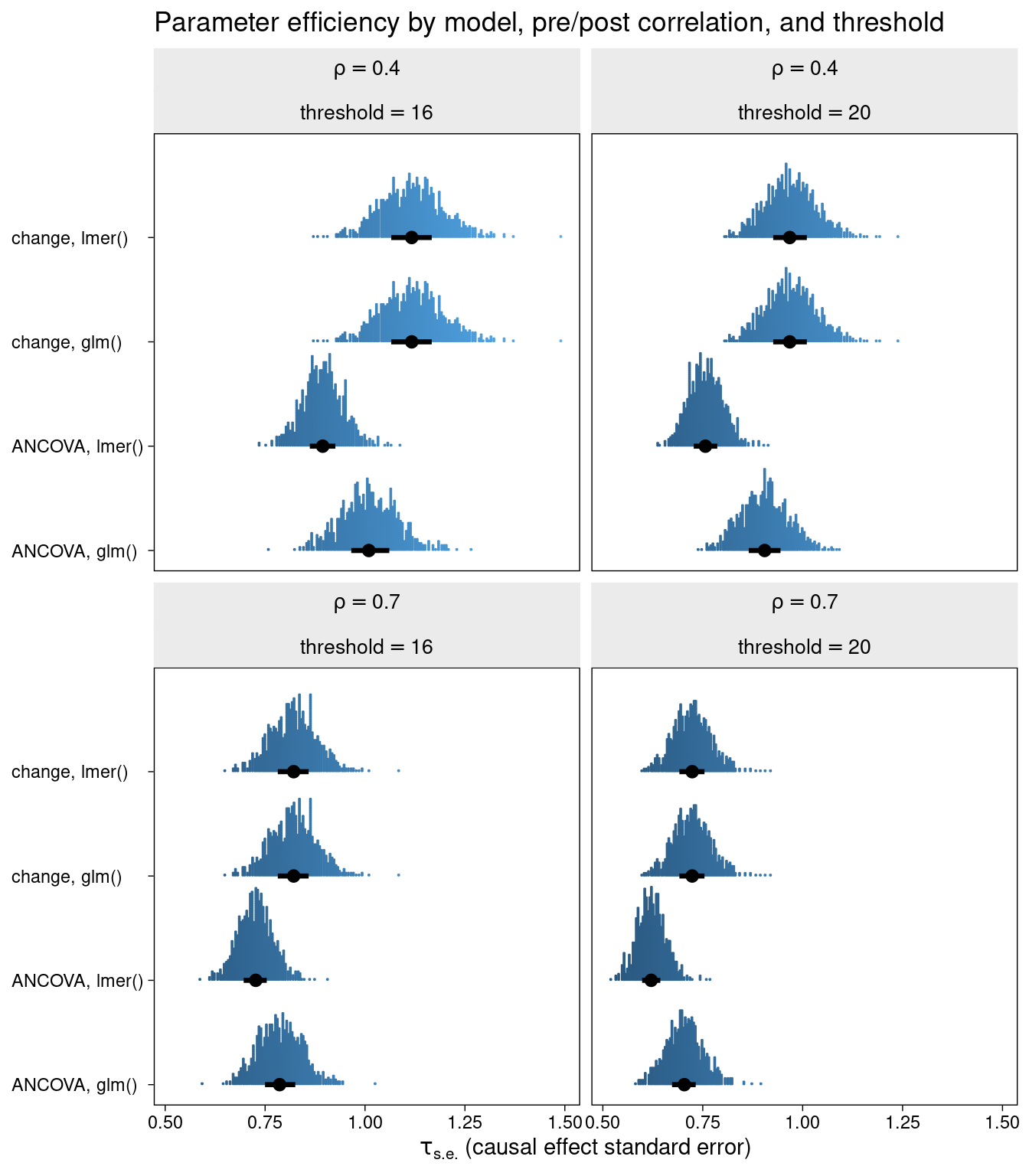
One thing is clearly similar between this and SK’s original simultaion: the ANCOVA and LMM ANCOVA models clearly beat the change models in terms of efficiency, especially when pre-post correlation is relatively low. There is also a major difference. That is, the LMM ANCOVA method stands out as being the most efficient, particularly when baseline truncation is strong.
Lastly, the percentage coverage of the 95% CI for each model type is compared.
bind_rows(
  sim.4.16 %>% mutate(rho = .4, threshold = 16),
  sim.4.20 %>% mutate(rho = .4, threshold = 20),
  sim.7.16 %>% mutate(rho = .7, threshold = 16),
  sim.7.20 %>% mutate(rho = .7, threshold = 20)) %>%
  mutate(type = str_c(model, ", ", method),
         rho = str_c("rho==", rho),
         threshold = str_c("threshold =", threshold)) %>%

  mutate(covered = if_else(conf.low < -6 & conf.high > -6, 1, 0)) %>%
  group_by(type, rho, threshold, covered) %>%
  tally() %>%
  mutate(coverage = n/sum(n) * 100) %>%
  filter(covered == 1) %>%
  ggplot(aes(x = type, y = coverage, colour = threshold)) +
  geom_hline(aes(yintercept = 94), colour = "grey") +
  geom_hline(aes(yintercept = 96), colour = "grey") +
  geom_point(position = position_dodge(0.25)) +
  facet_wrap(~rho, labeller = label_parsed) +
  theme(axis.text.x = element_text(angle = 90)) +
  ylim(c(85,100)) +
  labs(y = "Coverage %", x = "")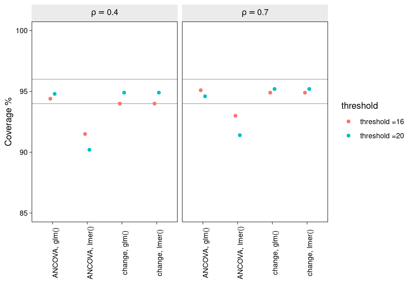
Under most conditions, each of the methods produces intervals with nominal coverage. Notably, however, the ANCOVA LMM method tends to produce confidence intervals which are somewhat too narrow. And this seems to be worse in cases of low pre-post correlation and when the degree of baseline truncation is large.
Why truncation appears to produce overly confident inferences from the ANCOVA LMM in particular is, to me, somewhat of a mystery. One possibility is that the error variance at baseline is considerably lower than at post test, and this heteroscedasticity is causing problems for the ANCOVA LMM in particular.
Distributional model with glmmTMB
To investigate this possibility, using the example dataset created above, we fit a distributional model in which the error variance is allowed to vary by time in the LMM ANCOVA.
The model, in statistical notation is,
\[ \begin{align*} y_{it} & \sim \mathcal N(\mu_{it}, \sigma_{e_{it}}) \\ \mu _{it} & = \beta_0 + \beta_1 \text{time}_{it} + \beta_2 \text{tx}_{it}\text{time}_{it} + u_{0i} \\ u_{0i} & \sim \mathcal N(0, \sigma_0) \\ \log(\sigma_{e_{it}}) & \sim \delta_0 + \delta_1\text{time}_{it} \end{align*} \]
The model is fit using R package glmmTMB:
dm1 <-
  glmmTMB(
    data = dl,
    y ~ 1 + time + tx:time + (1 | id),
    dispformula = ~ time, REML = T)

summary(dm1)
Family: gaussian ( identity )
Formula: y ~ 1 + time + tx:time + (1 | id)
Dispersion: ~time
Data: dl
AIC BIC logLik deviance df.resid
1728.4 1750.6 -858.2 1716.4 290
Random effects:
Conditional model:
Groups Name Variance Std.Dev.
id (Intercept) 6.632 2.575
Residual NA NA
Number of obs: 296, groups: id, 148
Conditional model:
Estimate Std. Error z value Pr(>|z|)
(Intercept) 24.8620 0.3117 79.76 < 2e-16 ***
time -3.0291 0.6276 -4.83 1.39e-06 ***
time:tx -5.2394 0.8498 -6.17 7.02e-10 ***
---
Signif. codes: 0 '***' 0.001 '**' 0.01 '*' 0.05 '.' 0.1 ' ' 1
Dispersion model:
Estimate Std. Error z value Pr(>|z|)
(Intercept) 1.0236 0.1195 8.564 < 2e-16 ***
time 0.5465 0.1394 3.921 8.82e-05 ***
---
Signif. codes: 0 '***' 0.001 '**' 0.01 '*' 0.05 '.' 0.1 ' ' 1There is strong evidence that the residual variance, sigma, varies between baseline and follow-up - the model estimate \(\delta_1\) (modelled on the log scale) indicates that residual variation at follow-up is exp(1.09) = 3-fold higher at follow-up than baseline.
Comparing the classic LMM with the distributional model by AIC:
l1 <- lmer(
    data = dl,
    y ~ 1 + time + tx:time + (1 | id))

AIC(l1, dm1)
df AIC
l1 5 1747.420
dm1 6 1728.437There is evidence that the distributional model produces better fit to data (lower AIC).
To contrast this distributional model with the previously described methods, we extend the simulation study described above to include the models fit via glmmTMB.
sim_fit <- function(seed = seed, n = n, tau = -6, rho = rho,
                    threshold = threshold) {

  # population values
  m <- 20
  s <- 6

  # simulate wide
  set.seed(seed)

  dw <-
    rnorm_multi(
      n = n,
      mu = c(m, m),
      sd = c(s, s),
      r = rho,
      varnames = list("pre", "post")
    ) %>%
    mutate(tx = rep(0:1, each = n / 2)) %>%
    mutate(post = ifelse(tx == 1, post + tau, post))

  # apply exclusion criteria

  dw <-
    dw %>% filter(pre > threshold)

  # make long
  dl <- dw %>%
    mutate(id = 1:n()) %>%
    pivot_longer(pre:post,
                 names_to = "wave",
                 values_to = "y") %>%
    mutate(time = ifelse(wave == "pre", 0, 1))

  # fit the models
  dm1 <- glmmTMB(
    data = dl,
    y ~ 1 + tx + time + tx:time + (1 | id),
    dispformula = ~ time, REML = T)

  dm2 <- glmmTMB(
    data = dl,
    y ~ 1 + time + tx:time + (1 | id),
    dispformula = ~ time, REML = T)

  # summarize

bind_rows(
  broom.mixed::tidy(dm1, conf.int=T)[4,c(5:7,9:10)],
  broom.mixed::tidy(dm2, conf.int=T)[3,c(5:7,9:10)]) %>%
  mutate(method = rep("glmmTMB", each = 2),
         model = c("change", "ANCOVA"))

}
Fit the distributional model to 1000 simulated datasets:
plan(multisession, workers = 4)

# rho = 0.4
sim.4.16.d <- tibble(seed = 1:1000) %>%
  mutate(tidy = future_map(seed, sim_fit, rho = .4,
                    threshold = 16, n = 160)) %>%
  unnest(tidy)

plan(multisession, workers = 4)

sim.4.20.d <- tibble(seed = 1:1000) %>%
  mutate(tidy = future_map(seed, sim_fit, rho = .4,
                    threshold = 20, n = 300)) %>%
  unnest(tidy)

# rho = .7

plan(multisession, workers = 4)

sim.7.16.d <- tibble(seed = 1:1000) %>%
  mutate(tidy = future_map(seed, sim_fit, rho = .7,
                    threshold = 16, n = 160)) %>%
  unnest(tidy)

plan(multisession, workers = 4)

sim.7.20.d <- tibble(seed = 1:1000) %>%
  mutate(tidy = future_map(seed, sim_fit, rho = .7,
                    threshold = 20, n = 300)) %>%
  unnest(tidy)
Results part 2
The bias in the estimation of the treatment effect is displayed for each of the combinations of method, correlation, and inclusion threshold.
bind_rows(
  sim.4.16 %>% mutate(rho = .4, threshold = 16),
  sim.4.20 %>% mutate(rho = .4, threshold = 20),
  sim.7.16 %>% mutate(rho = .7, threshold = 16),
  sim.7.20 %>% mutate(rho = .7, threshold = 20),
  sim.4.16.d %>% mutate(rho = .4, threshold = 16),
  sim.4.20.d %>% mutate(rho = .4, threshold = 20),
  sim.7.16.d %>% mutate(rho = .7, threshold = 16),
  sim.7.20.d %>% mutate(rho = .7, threshold = 20)) %>%
  mutate(type = str_c(model, ", ", method),
         rho = str_c("rho==", rho),
         threshold = str_c("threshold ==", threshold)) %>%

  ggplot(aes(x = estimate, y = type, slab_color = stat(x), slab_fill = stat(x))) +
  geom_vline(xintercept = -6, color = "grey67") +
  stat_dotsinterval(.width = .5, slab_shape = 22) +
  labs(title = "Parameter bias by model, pre/post correlation, and threshold",
       x = expression(hat(tau)*" (causal effect point estimate)"),
       y = NULL) +
  scale_slab_fill_continuous(limits = c(0, NA)) +
  scale_slab_color_continuous(limits = c(0, NA)) +
  coord_cartesian(ylim = c(1.4, NA)) +
  theme(axis.text.y = element_text(hjust = 0),
        legend.position = "none") +
  facet_wrap(vars(rho, threshold), labeller = label_parsed)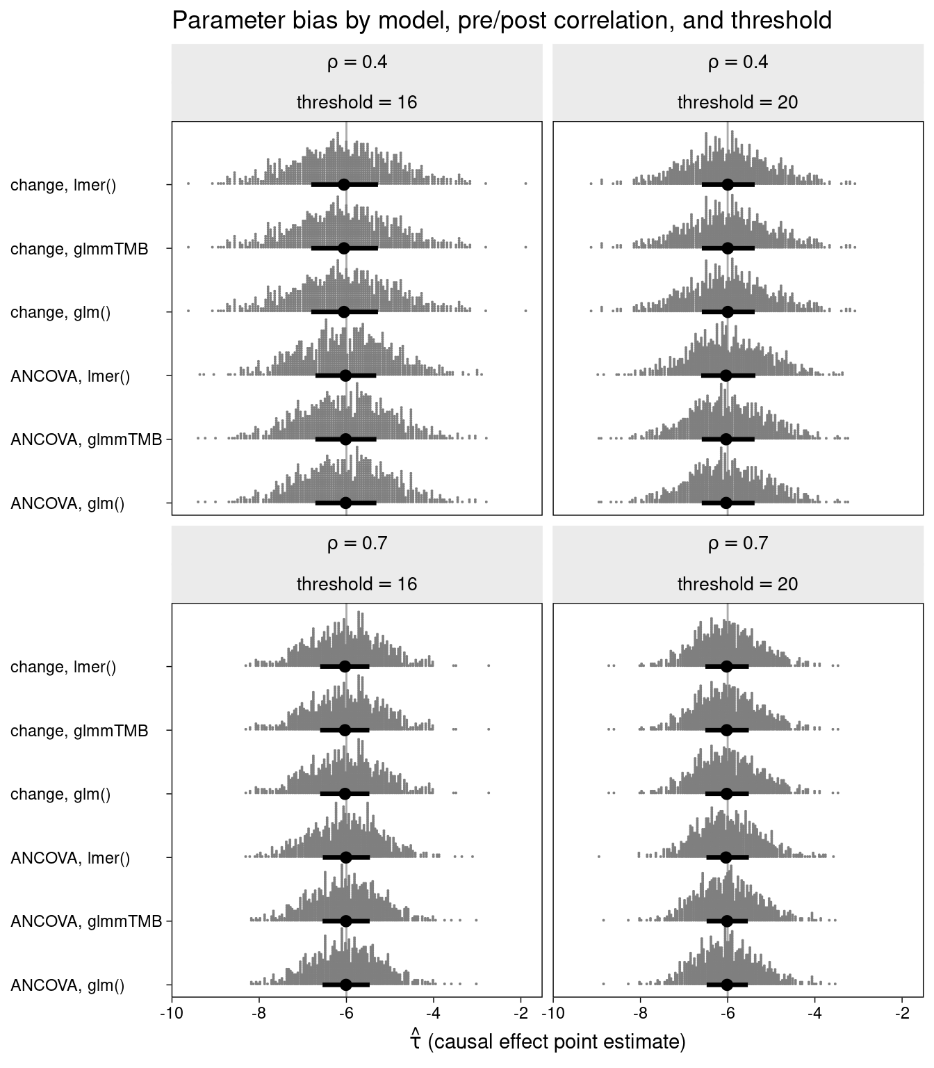
Again, there is no evidence of bias associated with any of the methods.
The efficiency (standard error of the treatment effect) is again displayed for each of the methods.
### Efficiency

bind_rows(
  sim.4.16 %>% mutate(rho = .4, threshold = 16),
  sim.4.20 %>% mutate(rho = .4, threshold = 20),
  sim.7.16 %>% mutate(rho = .7, threshold = 16),
  sim.7.20 %>% mutate(rho = .7, threshold = 20),
  sim.4.16.d %>% mutate(rho = .4, threshold = 16),
  sim.4.20.d %>% mutate(rho = .4, threshold = 20),
  sim.7.16.d %>% mutate(rho = .7, threshold = 16),
  sim.7.20.d %>% mutate(rho = .7, threshold = 20)) %>%
  mutate(type = str_c(model, ", ", method),
         rho = str_c("rho==", rho),
         threshold = str_c("threshold ==", threshold)) %>%

  ggplot(aes(x = std.error, y = type, slab_color = stat(x), slab_fill = stat(x))) +
  stat_dotsinterval(.width = .5, slab_shape = 22) +
  labs(title = "Parameter efficiency by model, pre/post correlation, and threshold",
       x = expression(tau[s.e.]*" (causal effect standard error)"),
       y = NULL) +
  scale_slab_fill_continuous(limits = c(0, NA)) +
  scale_slab_color_continuous(limits = c(0, NA)) +
  coord_cartesian(ylim = c(1.4, NA)) +
  theme(axis.text.y = element_text(hjust = 0),
        legend.position = "none") +
  facet_wrap(vars(rho, threshold), labeller = label_parsed)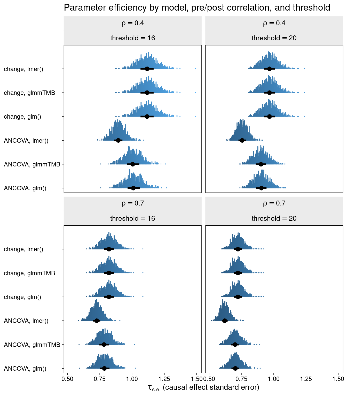
It seems that the classic change LMM, the distributional change LMM, and the glm change model are all equivalent in terms of efficiency.They are clearly outperformed by their ANCOVA counterparts in all cases.
But here is the interesting result. When extending the LMM ANCOVA to include a model for sigma (residual variance), the efficiency is equivalent to that of the ANCOVA glm.
Here we compare coverage of the 95% intervals for each method:
bind_rows(
  sim.4.16 %>% mutate(rho = .4, threshold = 16),
  sim.4.20 %>% mutate(rho = .4, threshold = 20),
  sim.7.16 %>% mutate(rho = .7, threshold = 16),
  sim.7.20 %>% mutate(rho = .7, threshold = 20),
  sim.4.16.d %>% mutate(rho = .4, threshold = 16),
  sim.4.20.d %>% mutate(rho = .4, threshold = 20),
  sim.7.16.d %>% mutate(rho = .7, threshold = 16),
  sim.7.20.d %>% mutate(rho = .7, threshold = 20)) %>%
  mutate(type = str_c(model, ", ", method),
         rho = str_c("rho==", rho),
         threshold = str_c("threshold =", threshold)) %>%

  mutate(covered = if_else(conf.low < -6 & conf.high > -6, 1, 0)) %>%
  group_by(type, rho, threshold, covered) %>%
  tally() %>%
  mutate(coverage = n/sum(n) * 100) %>%
  filter(covered == 1) %>%
  ggplot(aes(x = type, y = coverage, colour = threshold)) +
  geom_hline(aes(yintercept = 94), colour = "grey") +
  geom_hline(aes(yintercept = 96), colour = "grey") +
  geom_point(position = position_dodge(0.25)) +
  facet_wrap(~rho, labeller = label_parsed) +
  theme(axis.text.x = element_text(angle = 90)) +
  ylim(c(85,100)) +
  labs(y = "Coverage %", x = "")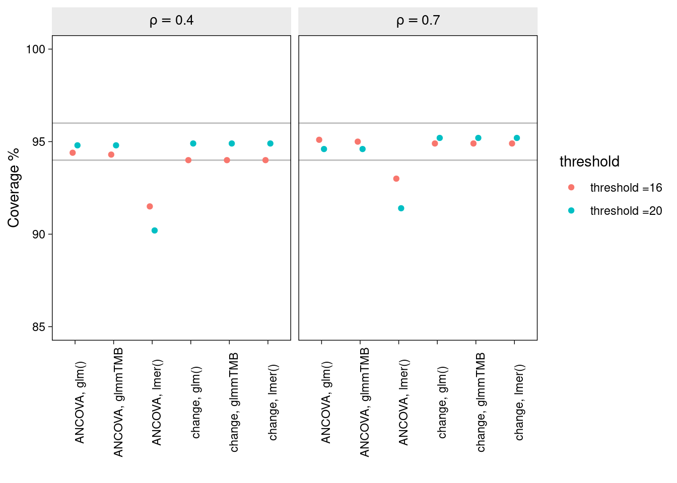
Again, all methods, excluding the ANCOVA lmm, produce nominal coverage. But it seems that by adding a model for sigma to the ANCOVA lmm, thereby accounting for the unequal variance between time-points, has solved its undercoverage problem.
Conclusion
Under these specific conditions, a couple of clear themes emerge:
The typical glm ANCOVA is a safe bet - producing good efficiency and nominal coverage in all situations considered.
The LMM ANCOVA model is anticonservative in the context of baseline truncation, and this is worse with higher baseline truncation and lower pre-post correlation.
The anticonservatism of the ANCOVA lmm, when baseline has a truncated distribution, can be rescued by allowing the residual variance to vary by time, as in a glmmTMB distributional model.